
BLUEPRINT ARTICLE - SELFRIDGES


BLOG ITEM INFORMATION
Produce: Jamie Fobert Architects Womenswear Gallery in Selfridges
As featured in Blueprint May 21, 2012
By Johnny Tucker
You know you’re doing something right when on the opening night of one project the client offers you another. That happened to Jamie Fobert, principal of Jamie Fobert Architects, at the launch party for the Selfridges women’s shoe department. That was the largest such undertaking in Europe and the return per sq ft has surprised pretty much everyone. Now the Fobert-designed designer womenswear department has just opened at the Oxford Street store.
JFA has a varied portfolio of work. As well as these and other retail schemes, the practice’s projects also include turning Konstantin Melnikov’s iconic Bakhmetevsky Bus Garage in Moscow into an arts centre and the practice will be creating extensions to the Tate St Ives and Cambridge’s Kettle’s Yard gallery.
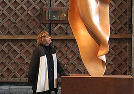
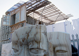
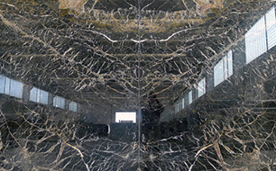
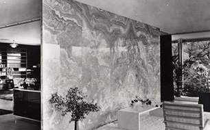
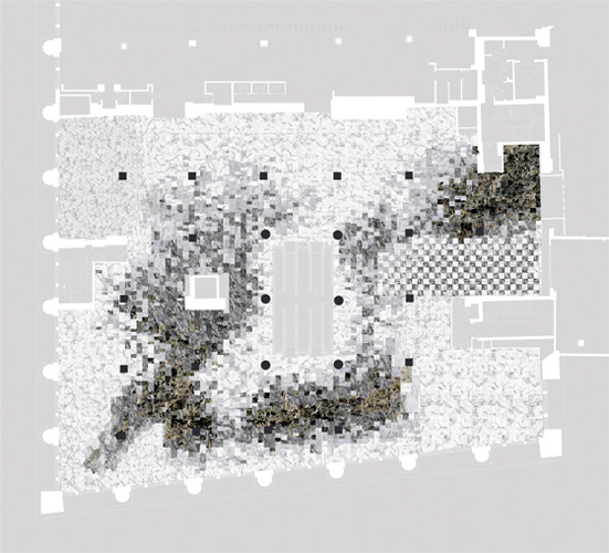
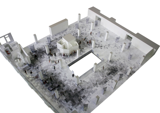
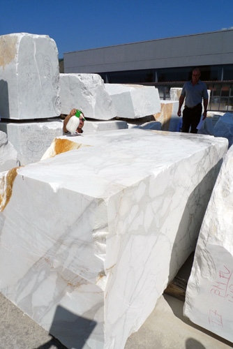
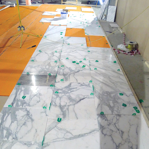
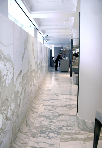
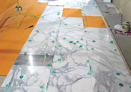
Back to Selfridges; absolutely central to the whole project is what seems like acres of the very finest marble flooring. ‘Department stores nearly always have marble walkways and it is usually basic quality,’ says Fobert. ‘So we said, “Why don’t we take this thing, which is almost the most banal element of a department store, and elevate it so that it becomes something really beautiful, manipulating it so that it becomes sheer?”’ It was an idea that ended up with staff spending long hours in marble quarries north of Pisa, and then during the laying, working on a daily basis with stone masons, Stone Theatre.
The creative scheme was sparked off by a book of images Selfridges sent to JFA to show the sort of feel considered right for the project and the customers of this area, which houses a hand-picked selection of 10 major fashion brands. The ‘mood’ book featured natural stone, reflecting pools – water was considered at one point – and the quality of sheerness. In particular, there was one black and white seascape image by Japanese artist Hiroshi Sugimoto, which featured a smooth gradation from white sky at the top to black sea at the bottom.
The idea emerged to break up the floor with darker areas that would merge into lighter zones to add visual interest, ‘being fluid and creating pools’. Importantly though, these were not used to delineate the different retail concessions.
Fobert says that while searching the quarries of Italy they had expected to find a side of a mountain that fitted in with their gradated scheme, but it just wasn’t the case. ‘It turned out to be quite a lot more complicated than we originally thought,’ he adds.
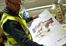
That’s why they had to choose carefully, literally at the rock face. Photos were sent from Italy of pieces as they were being cut and then it came to the laying: the stone masons would dry place around 10 sq m of the tiles at a time and the architect would come in and finesse them, moving some, turning some, removing some, in order to get the flow of the pattern exactly right. ‘At first it was slightly bewildering to the people laying the stones,’ explains Fobert, ‘but as we went forward, like all good craftsmen, they understood more and more what we were trying to achieve.’
Fobert also had to work closely with the brands themselves. ‘They were universally keen on the design,’ he enthuses. Many of the concessions, particularly , Céline, Prada, Givency and Balenciaga have taken the idea and run with it, creating smooth marble transitions into their own areas. Some have even carried the marble on into merchandising units.
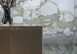
Despite all this concentration on the floor, the overall effect is actually one of stylish understatement, until you reach the point where the wall curves at the windows and then carries on upwards to a height of around 2m. It’s a ‘Wow’, almost ‘WTF’ moment. The marble rising up past the windows is a mere 5mm thick, which gives it a beautiful translucency when the sun is shining through. To avoid a harsh line where the thicker 25mm flooring and curving marble joins the upright, Fobert added a graduated film onto the back of the marble to smooth out the transition.
And lest you think the whole project has only been about the floor, it has to be said that this has been truly architectural in its scale.
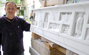
The scheme has also been about taking the area right back to its shell. The windows have been exposed, coffers put back, columns reclad and returned to their original condition – where they were missing detail, that has been replicated using plaster casts of similar ones on the floor below. The fire curtains and air handling, which were old to say the least, were completely reconfigured and replaced.
Finally, the other thing of note is the sheer amount of space given over to the fitting rooms. Selfridges could have easily squeezed in another brand, but instead let Fobert continue to play the luxury card and provide a large space in keeping with the creative ethos.
To see the completed project please go to:
http://www.stonetheatre.com/page/ commercial/selfridges-designer-floor